
A new look for ConscientAI
A measured rebrand for a bespoke AI solutions provider
Brand Identity, Brand Strategy, Graphic Design

A new look for ConscientAI
A measured rebrand for a bespoke AI solutions provider
Brand Identity, Brand Strategy, Graphic Design


A new look for ConscientAI
A measured rebrand for a bespoke AI solutions provider
Brand Identity, Brand Strategy, Graphic Design

Background
ConscientAI’s rebrand presented us with a unique challenge as we had to reimagine their brand while preserving its core identity and a particular shade of blue that held sentimental value for the founder.
The company began crafting bespoke AI solutions for enterprise clients long before the field of AI had its moment in the spotlight. As a fledgling startup, they didn't have the resources to spend much time on their brand identity; survival and securing a roster of clients became the key priority. Fast forward to 2024, and with AI having become a buzzword, it was time for ConscientAI’s brand identity to receive a 'facelift.'
The Brief
Though not set in stone, we were asked if we could work within two constraints. The first being that we had to ensure the rebranding did not stray too far from the current identity, as it could result in losing some hard-earned goodwill. And second, we had to incorporate a specific shade of blue into the new identity, as it held a special place in the heart of the founder.
A typeface can change a lot of things
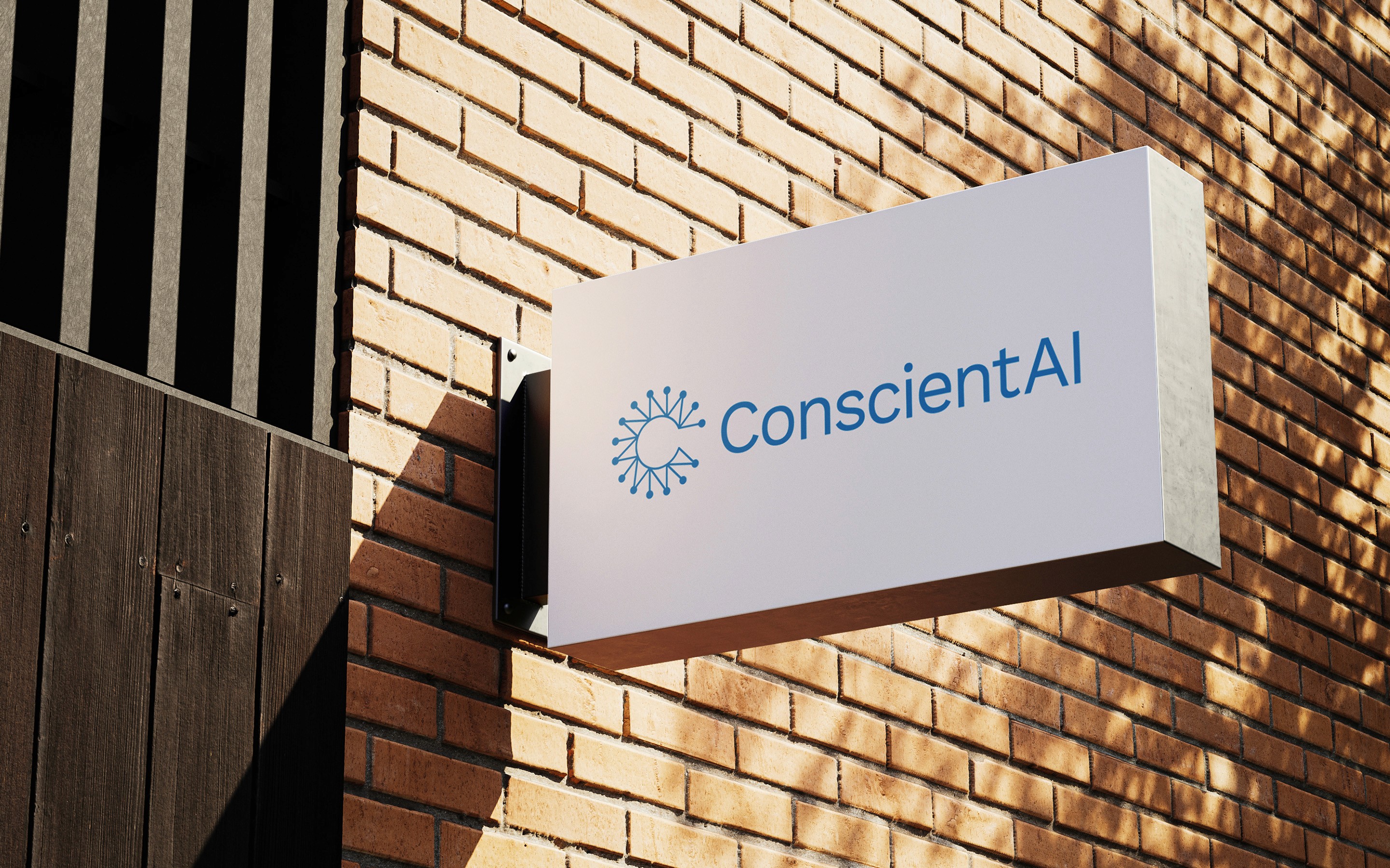
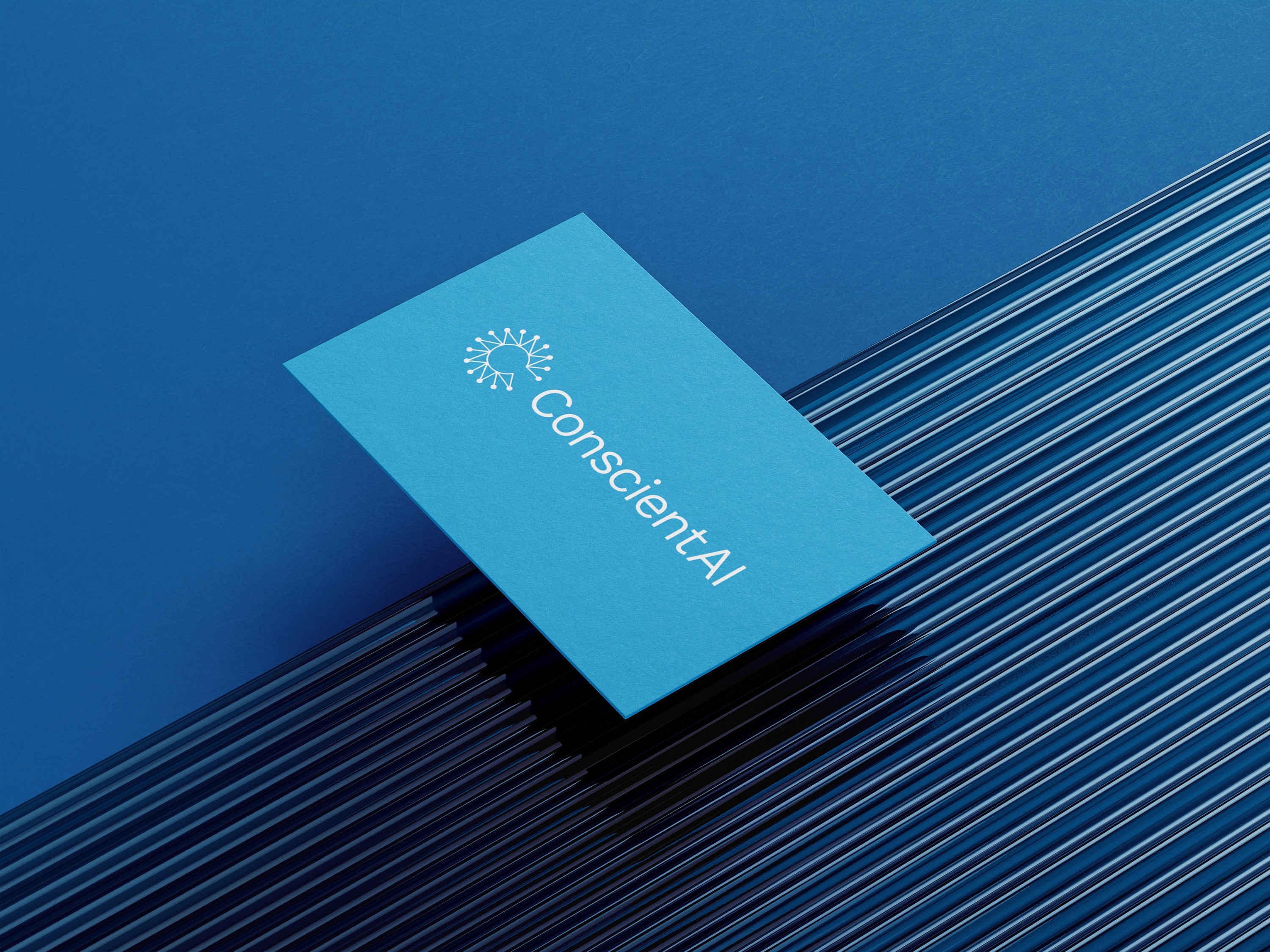
Good font choices can have an outsized impact on a brand’s identity, and we decided to leave the ‘C’ icon intact while focusing our attention on modernizing the wordmark instead. We chose Work Sans, a humanistic typeface with neat letter forms. It was the key to giving the new identity a fresh and energetic feel without resulting in too drastic a change.
Work Sans embodies the characteristics of being friendly and human, yet sophisticated. In our view, it is also the perfect complement to what ConscientAI has set out to do.
Playing with color
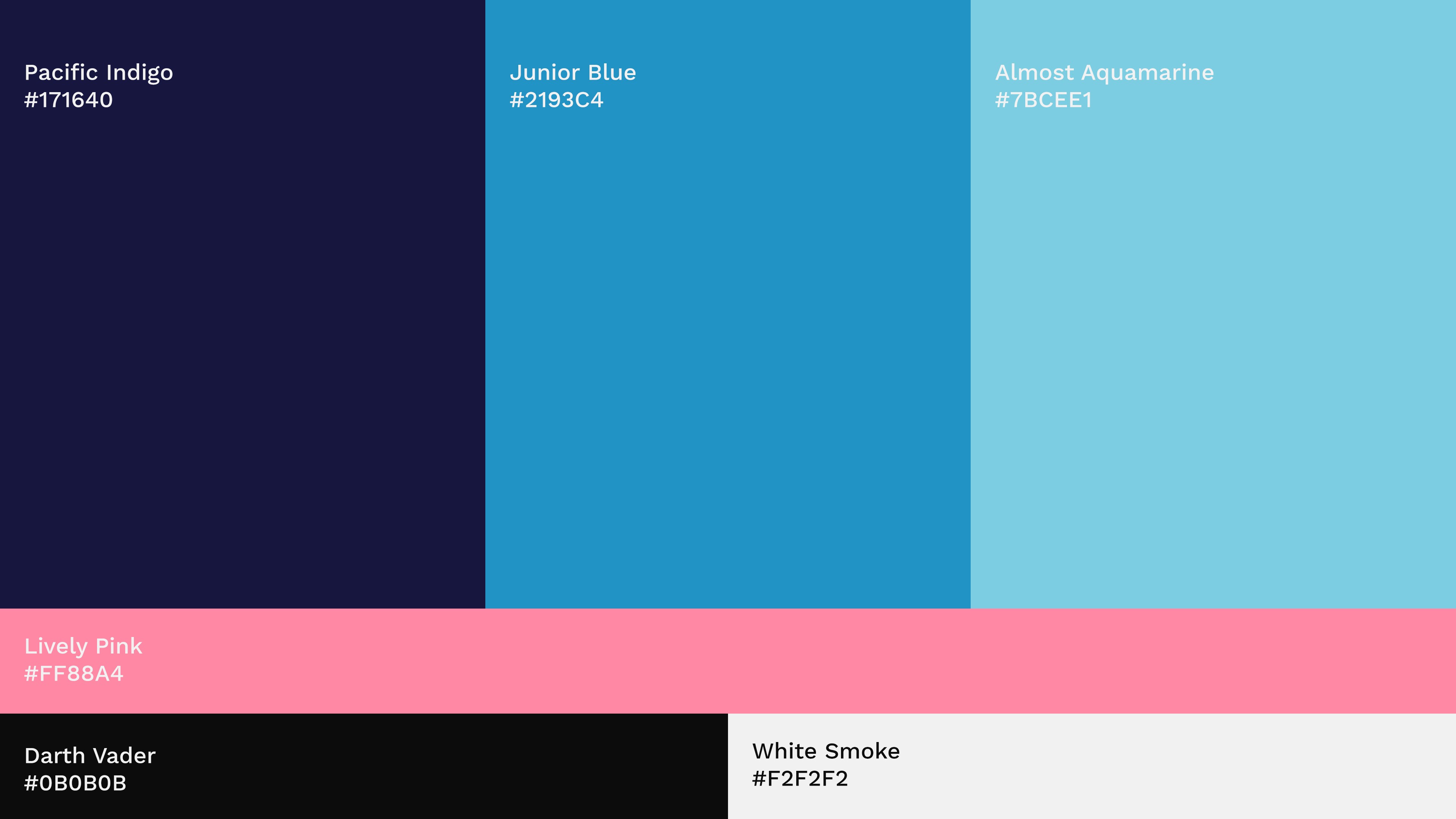
The specific shade of blue was preserved and became the foundation of the new color palette we dreamt up for ConscientAI. Two colors on either side of the base color were chosen, and paired with a pale pink, which could be used as a secondary color.
Conclusion
The identity that emerged at the conclusion of this exercise not only satisfied the two constraints mentioned previously but also provided ConscientAI with a modern and versatile brand architecture that can be put to good use across different media.
Background
ConscientAI’s rebrand presented us with a unique challenge as we had to reimagine their brand while preserving its core identity and a particular shade of blue that held sentimental value for the founder.
The company began crafting bespoke AI solutions for enterprise clients long before the field of AI had its moment in the spotlight. As a fledgling startup, they didn't have the resources to spend much time on their brand identity; survival and securing a roster of clients became the key priority. Fast forward to 2024, and with AI having become a buzzword, it was time for ConscientAI’s brand identity to receive a 'facelift.'
The Brief
Though not set in stone, we were asked if we could work within two constraints. The first being that we had to ensure the rebranding did not stray too far from the current identity, as it could result in losing some hard-earned goodwill. And second, we had to incorporate a specific shade of blue into the new identity, as it held a special place in the heart of the founder.
A typeface can change a lot of things
Good font choices can have an outsized impact on a brand’s identity, and we decided to leave the ‘C’ icon intact while focusing our attention on modernizing the wordmark instead. We chose Work Sans, a humanistic typeface with neat letter forms. It was the key to giving the new identity a fresh and energetic feel without resulting in too drastic a change.
Work Sans embodies the characteristics of being friendly and human, yet sophisticated. In our view, it is also the perfect complement to what ConscientAI has set out to do.

Playing with color
The specific shade of blue was preserved and became the foundation of the new color palette we dreamt up for ConscientAI. Two colors on either side of the base color were chosen, and paired with a pale pink, which could be used as a secondary color.

Conclusion
The identity that emerged at the conclusion of this exercise not only satisfied the two constraints mentioned previously but also provided ConscientAI with a modern and versatile brand architecture that can be put to good use across different media.
Background
ConscientAI’s rebrand presented us with a unique challenge as we had to reimagine their brand while preserving its core identity and a particular shade of blue that held sentimental value for the founder.
The company began crafting bespoke AI solutions for enterprise clients long before the field of AI had its moment in the spotlight. As a fledgling startup, they didn't have the resources to spend much time on their brand identity; survival and securing a roster of clients became the key priority. Fast forward to 2024, and with AI having become a buzzword, it was time for ConscientAI’s brand identity to receive a 'facelift.'
The Brief
Though not set in stone, we were asked if we could work within two constraints. The first being that we had to ensure the rebranding did not stray too far from the current identity, as it could result in losing some hard-earned goodwill. And second, we had to incorporate a specific shade of blue into the new identity, as it held a special place in the heart of the founder.
A typeface can change a lot of things
Good font choices can have an outsized impact on a brand’s identity, and we decided to leave the ‘C’ icon intact while focusing our attention on modernizing the wordmark instead. We chose Work Sans, a humanistic typeface with neat letter forms. It was the key to giving the new identity a fresh and energetic feel without resulting in too drastic a change.
Work Sans embodies the characteristics of being friendly and human, yet sophisticated. In our view, it is also the perfect complement to what ConscientAI has set out to do.

Playing with color
The specific shade of blue was preserved and became the foundation of the new color palette we dreamt up for ConscientAI. Two colors on either side of the base color were chosen, and paired with a pale pink, which could be used as a secondary color.

Conclusion
The identity that emerged at the conclusion of this exercise not only satisfied the two constraints mentioned previously but also provided ConscientAI with a modern and versatile brand architecture that can be put to good use across different media.

