
Repositioning Calcey for success
How we rejuvenated the brand presence and marketing strategy of one of Sri Lanka's pioneering global software engineering service providers.
Brand Identity, Art Direction, Video, Graphic Design
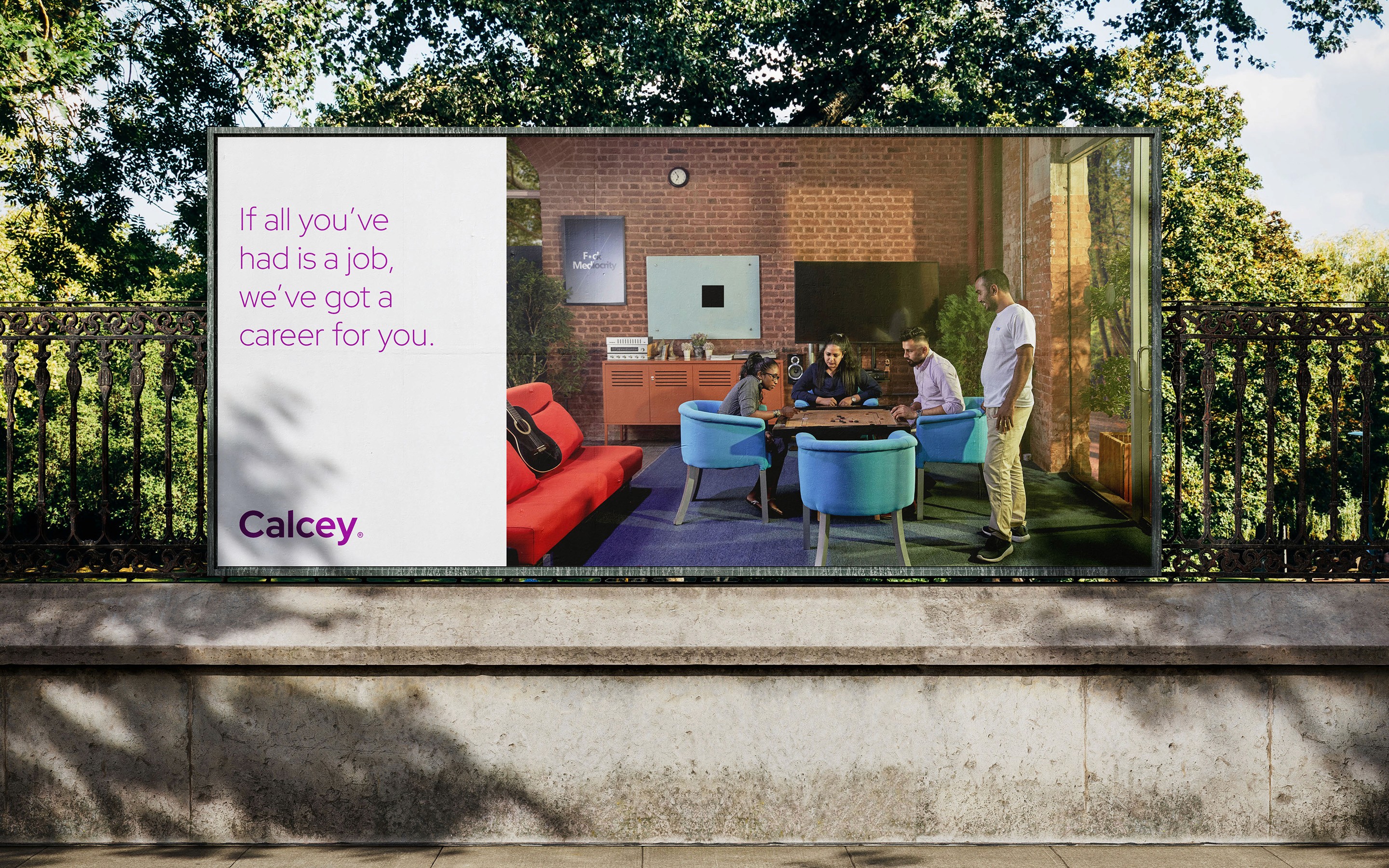

Repositioning Calcey for success
How we rejuvenated the brand presence and marketing strategy of one of Sri Lanka's pioneering global software engineering service providers.
Brand Identity, Art Direction, Video, Graphic Design


Repositioning Calcey for success
How we rejuvenated the brand presence and marketing strategy of one of Sri Lanka's pioneering global software engineering service providers.
Brand Identity, Art Direction, Video, Graphic Design

Background
Calcey Technologies—one of Sri Lanka’s earliest players in the IT industry, traces its roots back to a humble beginning in 2002. Founded by a Sri Lankan who built his career in the dot-com heyday of the late ‘90s, the company aimed to leverage the exceptional tech talent in Sri Lanka to serve tech companies in California. Hence the name ‘Calcey’ which is a portmanteau of the words California and Ceylon.
Calcey Technologies began operations in a rented office in the busy working class neighborhood of Maradana, the soot-faced cousin to the haughty, private school educated Colombo which is also the business capital of Sri Lanka. The company grew organically over the next two decades, but underinvestment in marketing and employer branding grew to become a serious problem in the late 2010s.
The Brief
The challenge brought to us by Calcey was twofold—refresh the company's visual identity and positioning while keeping intact the goodwill it had built up among a small segment of Sri Lanka's early software engineering community and formulate a powerful publicity campaign to get the company noticed so that it could resolve its hiring crunch.
Unfortunately for the company, its underinvestment in marketing had left is open to being lumped in with low cost fly-by-night operators in Asia. In fact, Calcey was the complete opposite. It competed on quality and was a premium service provider.
To top it all off, the budget available was a miniscule fraction of what is considered typical in our line of work. Not ones to shy away from a good challenge, we said 'yes!'.
Perception is a multi-sensory affair
It is not enough to just tell the world who you are. Others must feel the same way about it too. It's the same reason why Toyota decided to enter the luxury car segment under the Lexus monicker.
Focus group discussions revealed that the company's lengthy name ("Calcey Technologies") was working against it, so we recommended dropping the 'technologies' part. Presenting itself as 'Calcey' was the way forward.
We then came up with multiple variations of potential logos, before finally settling on a wordmark both for its simplicity and meaningful connection to how Calcey wished to portray itself. In design, wordmarks are some of the hardest to get right purely because their inherent simplicity makes every mistake very apparent and costly to fix. Similarly, in software engineering too, the best code is often the simplest. But to write efficient code, you really need to be an expert.
Our selection of the Red Hat typeface was deliberate, driven by its clean lines and inviting corners. It helped convey a polished and mature yet approachable image, again aligning seamlessly with Calcey's commitment to technical mastery.
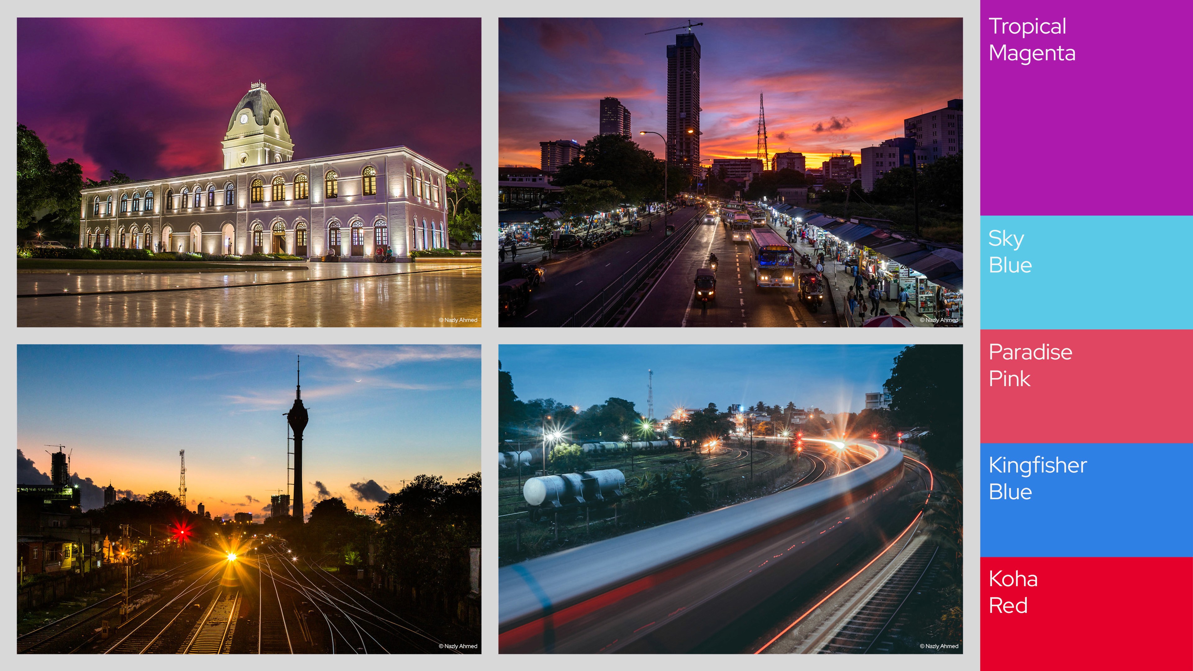
The color palette we curated drew inspiration from the captivating sunsets of Colombo. We wished to infuse local elements into Calcey’s brand identity because of the company’s unwavering commitment to Sri Lanka. From a strategic perspective, it rendered the palette unique among global peers, because where else will you find a Colombo sunset except in…Colombo?
Stories for the ages
Our research process brought us face-to-face with several unique Calceyites who were walking, talking exhibits for individual values the company desired. There was Ashinsa, a biologist by training and artist by passion, who embodied the company’s wish for its people to bring their full selves to work. Even the founder’s story was one of loss, bravery, and persistence in the midst of a bloody civil war which almost took the life of his first proper client.
We repurposed a select set of stories into a documentary video series. Each was scripted to provide a rough frame within which the subject can freely speak, so that every take can be smoothly stitched together during the postproduction process. There was an active element of direction involved so that every sentence was 'clean' without unnecessary filler words or run-ons.
Although traditional documentary films often eschew scripts, relying on the ease of following action and crafting the story during editing, in this instance, we carefully weighed the necessity for a script to align the documentary with its corporate film function.
Good stories can leave an audience spellbound
The conventional concern about the short attention spans of modern audiences is actually misplaced, because longer form content still thrives all around us, as long as they're crafted very well. Even popular YouTuber MKBHD regularly publishes videos which are nearly 15 minutes long, and each video goes viral without fail. In other words, if the story is worth watching, the audience will watch it.
When you make stories like this, it is important to cleverly impart scenes which help the viewer's brain make sense of the broader context. Imagine a shepherd observing the sunset from a hill, overseeing his flock grazing after a long day. This mental imagery naturally evokes a sense of beauty and optimism because the human brain inherently imparts meaning to visual and auditory stimuli. To seamlessly disguise this corporate film as a documentary, we strategically crafted scenes to establish the identity of the individuals involved without overtly spoon-feeding information to the audience.
Check out the full video series here.
New identity, new merch
In line with the rollout of the new brand identity, we redesigned all of Calcey's marketing collateral, company merchandise, and stationary. Going beyond mere graphic design, we painstakingly reviewed the content and tweaked it to reflect the new tone of voice.

Conclusion
The new visual identity and documentary combined with a concerted content distribution plan (a combo of paid marketing and distribution through micro-influencers), successfully garnered positive organic conversations around Calcey as a company. Our rebranding exercise extended so far as to revamp all of Calcey’s marketing collateral and formalize its various partnerships to reflect the new positioning.
Today, not only are twice as many applicants clamoring to apply for openings, but Calcey is also able to present itself to global clients as a high-end software product engineering company worthy of commanding premium prices while providing world-class levels of service.
Background
Calcey Technologies—one of Sri Lanka’s earliest players in the IT industry, traces its roots back to a humble beginning in 2002. Founded by a Sri Lankan who built his career in the dot-com heyday of the late ‘90s, the company aimed to leverage the exceptional tech talent in Sri Lanka to serve tech companies in California. Hence the name ‘Calcey’ which is a portmanteau of the words California and Ceylon.
Calcey Technologies began operations in a rented office in the busy working class neighborhood of Maradana, the soot-faced cousin to the haughty, private school educated Colombo which is also the business capital of Sri Lanka. The company grew organically over the next two decades, but underinvestment in marketing and employer branding grew to become a serious problem in the late 2010s.
The Brief
The challenge brought to us by Calcey was twofold—refresh the company's visual identity and positioning while keeping intact the goodwill it had built up among a small segment of Sri Lanka's early software engineering community and formulate a powerful publicity campaign to get the company noticed so that it could resolve its hiring crunch.
Unfortunately for the company, its underinvestment in marketing had left is open to being lumped in with low cost fly-by-night operators in Asia. In fact, Calcey was the complete opposite. It competed on quality and was a premium service provider.
To top it all off, the budget available was a miniscule fraction of what is considered typical in our line of work. Not ones to shy away from a good challenge, we said 'yes!'.
Perception is a multi-sensory affair
It is not enough to just tell the world who you are. Others must feel the same way about it too. It's the same reason why Toyota decided to enter the luxury car segment under the Lexus monicker.
Focus group discussions revealed that the company's lengthy name ("Calcey Technologies") was working against it, so we recommended dropping the 'technologies' part. Presenting itself as 'Calcey' was the way forward.
We then came up with multiple variations of potential logos, before finally settling on a wordmark both for its simplicity and meaningful connection to how Calcey wished to portray itself. In design, wordmarks are some of the hardest to get right purely because their inherent simplicity makes every mistake very apparent and costly to fix. Similarly, in software engineering too, the best code is often the simplest. But to write efficient code, you really need to be an expert.
Our selection of the Red Hat typeface was deliberate, driven by its clean lines and inviting corners. It helped convey a polished and mature yet approachable image, again aligning seamlessly with Calcey's commitment to technical mastery.
The color palette we curated drew inspiration from the captivating sunsets of Colombo. We wished to infuse local elements into Calcey’s brand identity because of the company’s unwavering commitment to Sri Lanka. From a strategic perspective, it rendered the palette unique among global peers, because where else will you find a Colombo sunset except in…Colombo?

Stories for the ages
Our research process brought us face-to-face with several unique Calceyites who were walking, talking exhibits for individual values the company desired. There was Ashinsa, a biologist by training and artist by passion, who embodied the company’s wish for its people to bring their full selves to work. Even the founder’s story was one of loss, bravery, and persistence in the midst of a bloody civil war which almost took the life of his first proper client.
We repurposed a select set of stories into a documentary video series. Each was scripted to provide a rough frame within which the subject can freely speak, so that every take can be smoothly stitched together during the postproduction process. There was an active element of direction involved so that every sentence was 'clean' without unnecessary filler words or run-ons.
Although traditional documentary films often eschew scripts, relying on the ease of following action and crafting the story during editing, in this instance, we carefully weighed the necessity for a script to align the documentary with its corporate film function.
Good stories can leave an audience spellbound
The conventional concern about the short attention spans of modern audiences is actually misplaced, because longer form content still thrives all around us, as long as they're crafted very well. Even popular YouTuber MKBHD regularly publishes videos which are nearly 15 minutes long, and each video goes viral without fail. In other words, if the story is worth watching, the audience will watch it.
When you make stories like this, it is important to cleverly impart scenes which help the viewer's brain make sense of the broader context. Imagine a shepherd observing the sunset from a hill, overseeing his flock grazing after a long day. This mental imagery naturally evokes a sense of beauty and optimism because the human brain inherently imparts meaning to visual and auditory stimuli. To seamlessly disguise this corporate film as a documentary, we strategically crafted scenes to establish the identity of the individuals involved without overtly spoon-feeding information to the audience.
Check out the full video series here.
New identity, new merch
In line with the rollout of the new brand identity, we redesigned all of Calcey's marketing collateral, company merchandise, and stationary. Going beyond mere graphic design, we painstakingly reviewed the content and tweaked it to reflect the new tone of voice.

Conclusion
The new visual identity and documentary combined with a concerted content distribution plan (a combo of paid marketing and distribution through micro-influencers), successfully garnered positive organic conversations around Calcey as a company. Our rebranding exercise extended so far as to revamp all of Calcey’s marketing collateral and formalize its various partnerships to reflect the new positioning.
Today, not only are twice as many applicants clamoring to apply for openings, but Calcey is also able to present itself to global clients as a high-end software product engineering company worthy of commanding premium prices while providing world-class levels of service.
Background
Calcey Technologies—one of Sri Lanka’s earliest players in the IT industry, traces its roots back to a humble beginning in 2002. Founded by a Sri Lankan who built his career in the dot-com heyday of the late ‘90s, the company aimed to leverage the exceptional tech talent in Sri Lanka to serve tech companies in California. Hence the name ‘Calcey’ which is a portmanteau of the words California and Ceylon.
Calcey Technologies began operations in a rented office in the busy working class neighborhood of Maradana, the soot-faced cousin to the haughty, private school educated Colombo which is also the business capital of Sri Lanka. The company grew organically over the next two decades, but underinvestment in marketing and employer branding grew to become a serious problem in the late 2010s.
The Brief
The challenge brought to us by Calcey was twofold—refresh the company's visual identity and positioning while keeping intact the goodwill it had built up among a small segment of Sri Lanka's early software engineering community and formulate a powerful publicity campaign to get the company noticed so that it could resolve its hiring crunch.
Unfortunately for the company, its underinvestment in marketing had left is open to being lumped in with low cost fly-by-night operators in Asia. In fact, Calcey was the complete opposite. It competed on quality and was a premium service provider.
To top it all off, the budget available was a miniscule fraction of what is considered typical in our line of work. Not ones to shy away from a good challenge, we said 'yes!'.
Perception is a multi-sensory affair
It is not enough to just tell the world who you are. Others must feel the same way about it too. It's the same reason why Toyota decided to enter the luxury car segment under the Lexus monicker.
Focus group discussions revealed that the company's lengthy name ("Calcey Technologies") was working against it, so we recommended dropping the 'technologies' part. Presenting itself as 'Calcey' was the way forward.
We then came up with multiple variations of potential logos, before finally settling on a wordmark both for its simplicity and meaningful connection to how Calcey wished to portray itself. In design, wordmarks are some of the hardest to get right purely because their inherent simplicity makes every mistake very apparent and costly to fix. Similarly, in software engineering too, the best code is often the simplest. But to write efficient code, you really need to be an expert.
Our selection of the Red Hat typeface was deliberate, driven by its clean lines and inviting corners. It helped convey a polished and mature yet approachable image, again aligning seamlessly with Calcey's commitment to technical mastery.
The color palette we curated drew inspiration from the captivating sunsets of Colombo. We wished to infuse local elements into Calcey’s brand identity because of the company’s unwavering commitment to Sri Lanka. From a strategic perspective, it rendered the palette unique among global peers, because where else will you find a Colombo sunset except in…Colombo?

Stories for the ages
Our research process brought us face-to-face with several unique Calceyites who were walking, talking exhibits for individual values the company desired. There was Ashinsa, a biologist by training and artist by passion, who embodied the company’s wish for its people to bring their full selves to work. Even the founder’s story was one of loss, bravery, and persistence in the midst of a bloody civil war which almost took the life of his first proper client.
We repurposed a select set of stories into a documentary video series. Each was scripted to provide a rough frame within which the subject can freely speak, so that every take can be smoothly stitched together during the postproduction process. There was an active element of direction involved so that every sentence was 'clean' without unnecessary filler words or run-ons.
Although traditional documentary films often eschew scripts, relying on the ease of following action and crafting the story during editing, in this instance, we carefully weighed the necessity for a script to align the documentary with its corporate film function.
Good stories can leave an audience spellbound
The conventional concern about the short attention spans of modern audiences is actually misplaced, because longer form content still thrives all around us, as long as they're crafted very well. Even popular YouTuber MKBHD regularly publishes videos which are nearly 15 minutes long, and each video goes viral without fail. In other words, if the story is worth watching, the audience will watch it.
When you make stories like this, it is important to cleverly impart scenes which help the viewer's brain make sense of the broader context. Imagine a shepherd observing the sunset from a hill, overseeing his flock grazing after a long day. This mental imagery naturally evokes a sense of beauty and optimism because the human brain inherently imparts meaning to visual and auditory stimuli. To seamlessly disguise this corporate film as a documentary, we strategically crafted scenes to establish the identity of the individuals involved without overtly spoon-feeding information to the audience.
Check out the full video series here.
New identity, new merch
In line with the rollout of the new brand identity, we redesigned all of Calcey's marketing collateral, company merchandise, and stationary. Going beyond mere graphic design, we painstakingly reviewed the content and tweaked it to reflect the new tone of voice.

Conclusion
The new visual identity and documentary combined with a concerted content distribution plan (a combo of paid marketing and distribution through micro-influencers), successfully garnered positive organic conversations around Calcey as a company. Our rebranding exercise extended so far as to revamp all of Calcey’s marketing collateral and formalize its various partnerships to reflect the new positioning.
Today, not only are twice as many applicants clamoring to apply for openings, but Calcey is also able to present itself to global clients as a high-end software product engineering company worthy of commanding premium prices while providing world-class levels of service.
